Better Nouveau
A project on April 2011
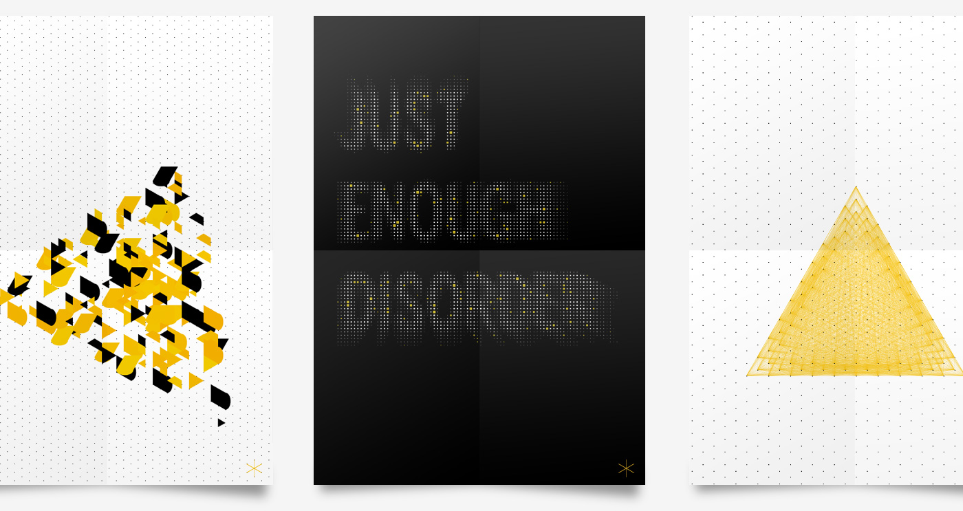
Better Nouveau is an independent design label and an innovation project initiated in June 2011 by ToDo.
The project was quite difficult because we built from scratch a full featured e-commerce website, organized the logistics to sell and ship the product and invent a totally new identity in a very tiny span of time.
My role was to lead the graphic design, coordinate the front-end and back-end development of the website and build the UI and UX of the platform.
At the moment the project is no more active, but the website is still online, with reduced functionalities: www.betternouveau.com
Before defining the identity I tried different approaches, then we decided for an hexagonal grid, which was perfect to have original appearance and consistency between all the visual elements.
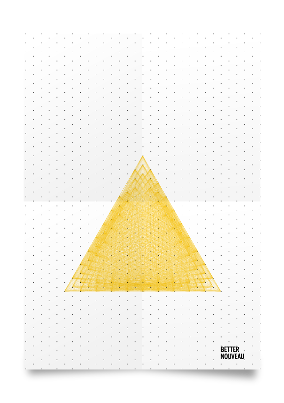
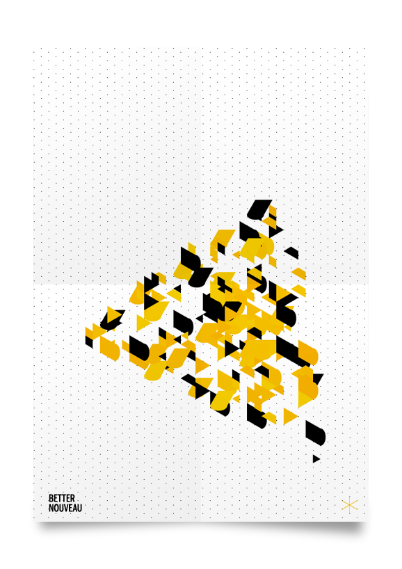
For some preliminary research I used Nodebox to produce some computational graphic and evaluate different possibilities.
Computational graphic
Using the hexagonal grid I realized a set of icons, to be used in the website and on printed material.
![]()
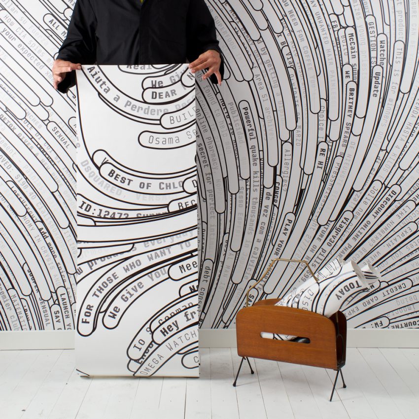
The website required a lot of work in terms of UI and UX and development, mostly because we wanted to sell custom generative products like Tweetghetto, a poster with users twitter timeline and Spamghetto a wallpaper based on the subjects of spam emails. So we had to build configurators, and specific interfaces to let users create their objects, save in their collection, buy them and then prepare all the data to let us start the production and ship the final object.
User Interface
We curated every detail of the interface, for example we invented a new approach to let user confirm an undoable action (for example delete items in the collection).
We wanted to get rid of the standard and annoying alert windows, and let the users do the task with minimum effort.
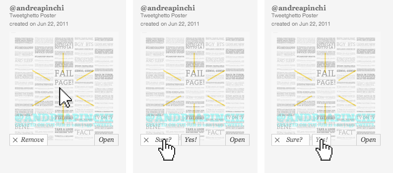
1. when hovering the box, the control buttons slide out from the bottom
2. hovering the “remove button”, the label becomes “Are you sure?” and the “Yes!” button appears next to it
3. moving the mouse it is possible to click over the “Yes!” button to confirm the action
The action to remove is pretty easy to understand to the medium user, so we presumed that just hovering the button she wanted to use it, so we just needed to avoid errors and mistakes forcing the user to move the mouse a bit and click the confirmation button. This option works well also for touch devices performing two taps.
Here some screenshot from the website.
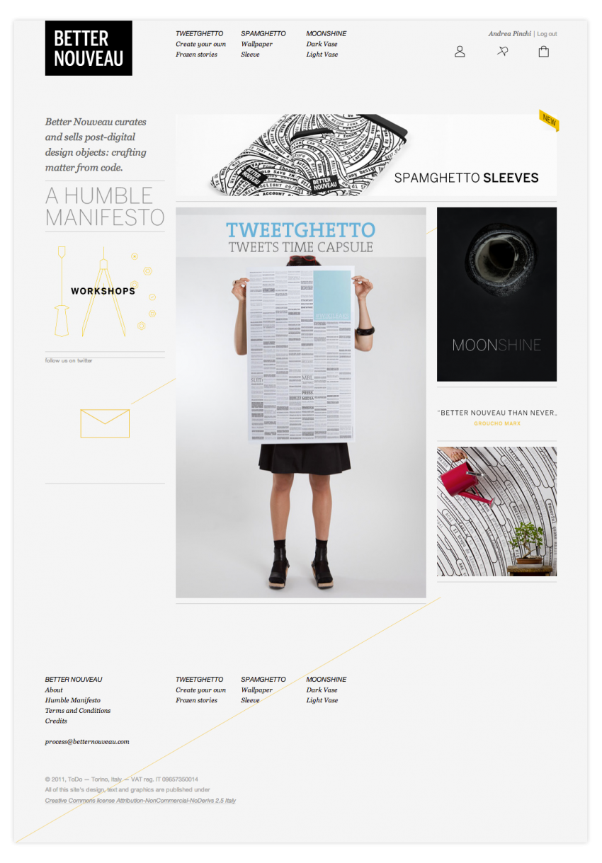
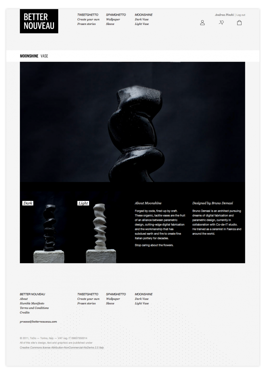
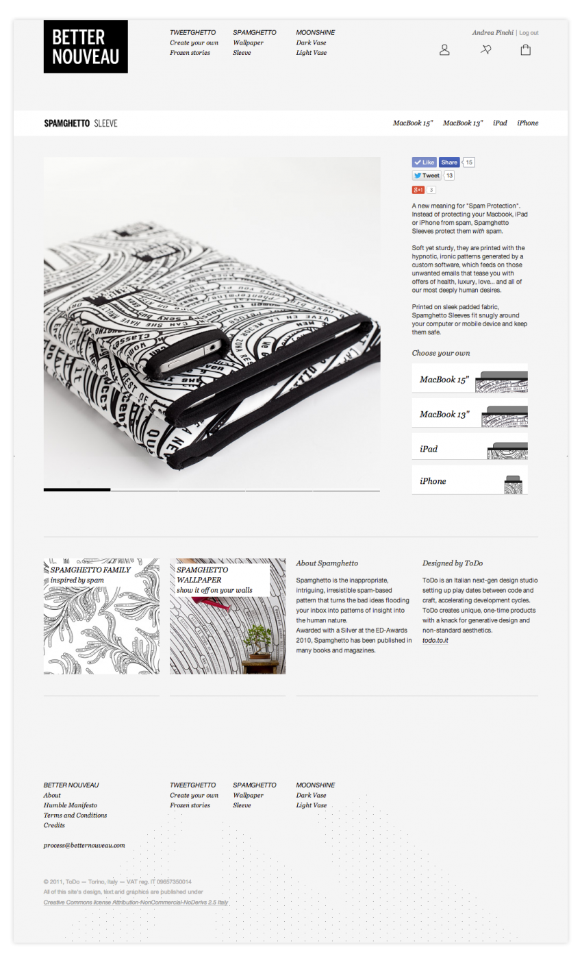
Definitely this was one of the most challenging project I had the opportunity to participate, because of the strict deadlines and the complexity of the whole system. Anyway I also learned a lot on how to lead a team and how to hit deadlines without sacrificing the quality of the output.